|
curtains
|
#1
18-01-2014
#2
18-01-2014
Do you have your shading on a separate layer to your pattern? If so - can we have a look at it with a plain colour behind? The pattern often hides problems in the shading, that putting it with another will bring out, and for me, what I do is have the shading as well as I can, then I can use it with anything.
With what you've got there, it looks like the smudge works better, but the more smudge is too much, and the blur is not enough.
With what you've got there, it looks like the smudge works better, but the more smudge is too much, and the blur is not enough.
#3
18-01-2014
#4
18-01-2014
This is the reason why you do a light colour - because it shows up all the problems.
With the curtain, the top half relies on your shading template to look like it's a curtain with folds. The bottom half has the mesh contributing to the folds.
Now that you've launched yourself into the world of creating its important to see how you can grow and become awesome. So I'm letting you know all the problems with your shading, rather than just commenting on your choice of technique to do the shading. I hope this is OK with you.
Here are the problems with your shading layer that I can see:
1. The shadows don't go up to the top of the curtain.
2. The shadows don't go down to the tie back.
3. If you have a look at the very top of the curtain you'll notice that it doesn't go straight across, there are undulations in the top. These are meant to match with the shading to provide a more realistic look for your curtains. Your shading doesn't match with all the undulations.
4. There are 2 parts to shading - shading, and highlighting. If you think about where the sun would hit the curtain, the top of the folds are going to be receiving more light, and the deeper in the fold will be in shadow, Your curtain looks like it's missing the highlighting.
![[Image: klcurtain.png]](http://www.simthing.net/lee/klcurtain.png)
I'm currently using Kate's defaults in my game (because they are awesome) and I've done a bit of a comparison picture for you so you can see the differences. I've also included a 1:1 size of her texture so you can download it and compare it to yours.
The only other thing I would say is that you need to add texture to your curtain rail. If you look around your house at the different textures in it, you'll notice there are no matte colours. A very light texturing to the pole willl make it look more real and less 'this is the mesh'.
With the curtain, the top half relies on your shading template to look like it's a curtain with folds. The bottom half has the mesh contributing to the folds.
Now that you've launched yourself into the world of creating its important to see how you can grow and become awesome.
 So I'm letting you know all the problems with your shading, rather than just commenting on your choice of technique to do the shading. I hope this is OK with you.
Here are the problems with your shading layer that I can see:
1. The shadows don't go up to the top of the curtain.
2. The shadows don't go down to the tie back.
3. If you have a look at the very top of the curtain you'll notice that it doesn't go straight across, there are undulations in the top. These are meant to match with the shading to provide a more realistic look for your curtains. Your shading doesn't match with all the undulations.
4. There are 2 parts to shading - shading, and highlighting. If you think about where the sun would hit the curtain, the top of the folds are going to be receiving more light, and the deeper in the fold will be in shadow, Your curtain looks like it's missing the highlighting.
![[Image: klcurtain.png]](http://www.simthing.net/lee/klcurtain.png)
I'm currently using Kate's defaults in my game (because they are awesome) and I've done a bit of a comparison picture for you so you can see the differences. I've also included a 1:1 size of her texture so you can download it and compare it to yours.
The only other thing I would say is that you need to add texture to your curtain rail. If you look around your house at the different textures in it, you'll notice there are no matte colours. A very light texturing to the pole willl make it look more real and less 'this is the mesh'.
#5
18-01-2014
Thank you for this, Kiri, it's really useful. Will have another go at this today.
Karen Lorraine, proud to be a member of LeeFish since Jan 2012.
#6
18-01-2014
Have played around in photoshop with shading for the curtain and the pole.

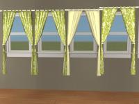
from the left
curtain 1: shading and slightly darker pole (new)
curtain 2: shading (new)
curtain 3: cream
curtain 4: original

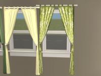
this is the new one with darker shading on the pole, curtain is the same as curtain 1 and 2.
from the left
curtain 1: shading and slightly darker pole (new)
curtain 2: shading (new)
curtain 3: cream
curtain 4: original
this is the new one with darker shading on the pole, curtain is the same as curtain 1 and 2.
Karen Lorraine, proud to be a member of LeeFish since Jan 2012.
#7
19-01-2014
That's looking much better Karen - good job! Now you've got the shading sorted you can make lots of curtains 

#8
24-01-2014
